I have chosen to use a footer my site map. The footer contains the same links (to all main pages) as the top navigation bar and will be present on each page to help make navigating the site as easy as possible.
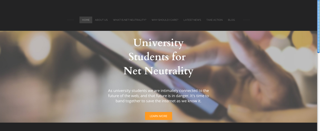
The main navigation consists of a link to the home page, about US page (about the organization), "What is Net Neutrality?", "Why should I care?", "Latest News", and "Take Action" pages. There is also a link to the class blog.
I have renamed the "Learn More page" to be "What is Net Neutrality" and this will function as the main resource for informing visitors about the basics of net neutrality. The "Why should I care?" page is going to focus on how net neutrality specifically affects university students. The "Latest News" page will be a place to get the latest updates on the fight for net neutrality. Finally the "Take Action" page will have resources for getting involved in the fight (including but limited to sample letters to representatives).
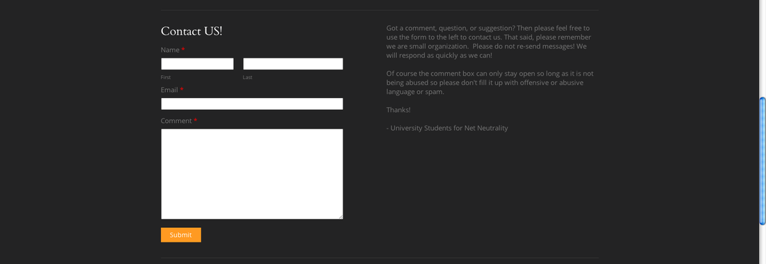
In order to keep my menu items to a maximum of seven and keep the navigation from getting congested, I have deleted the contact page and instead placed the contact form on the home page. I still intend for the home page to be a landing space designed to direct the visitor to the rest of the site, but I felt this was an appropriate compromise.
I want my navigation to be as simple and natural as possible. I don't want it's complexity to distract from the content. I want it to be effective, but in the background. Ideally it should be an afterthought to the visitor. I have chosen to include a footer for this reason. The visitor does not have to scroll back to the top to get to the next page they want to read. I am also placing social media and email links at the bottom of every page in order to encourage the visitor to check them out without making the visitor do any extra work to find them. I have also chosen simple but thought provoking names for the pages ("Why should I care?") that get the visitors attention and create interest.
The main navigation consists of a link to the home page, about US page (about the organization), "What is Net Neutrality?", "Why should I care?", "Latest News", and "Take Action" pages. There is also a link to the class blog.
I have renamed the "Learn More page" to be "What is Net Neutrality" and this will function as the main resource for informing visitors about the basics of net neutrality. The "Why should I care?" page is going to focus on how net neutrality specifically affects university students. The "Latest News" page will be a place to get the latest updates on the fight for net neutrality. Finally the "Take Action" page will have resources for getting involved in the fight (including but limited to sample letters to representatives).
In order to keep my menu items to a maximum of seven and keep the navigation from getting congested, I have deleted the contact page and instead placed the contact form on the home page. I still intend for the home page to be a landing space designed to direct the visitor to the rest of the site, but I felt this was an appropriate compromise.
I want my navigation to be as simple and natural as possible. I don't want it's complexity to distract from the content. I want it to be effective, but in the background. Ideally it should be an afterthought to the visitor. I have chosen to include a footer for this reason. The visitor does not have to scroll back to the top to get to the next page they want to read. I am also placing social media and email links at the bottom of every page in order to encourage the visitor to check them out without making the visitor do any extra work to find them. I have also chosen simple but thought provoking names for the pages ("Why should I care?") that get the visitors attention and create interest.
 RSS Feed