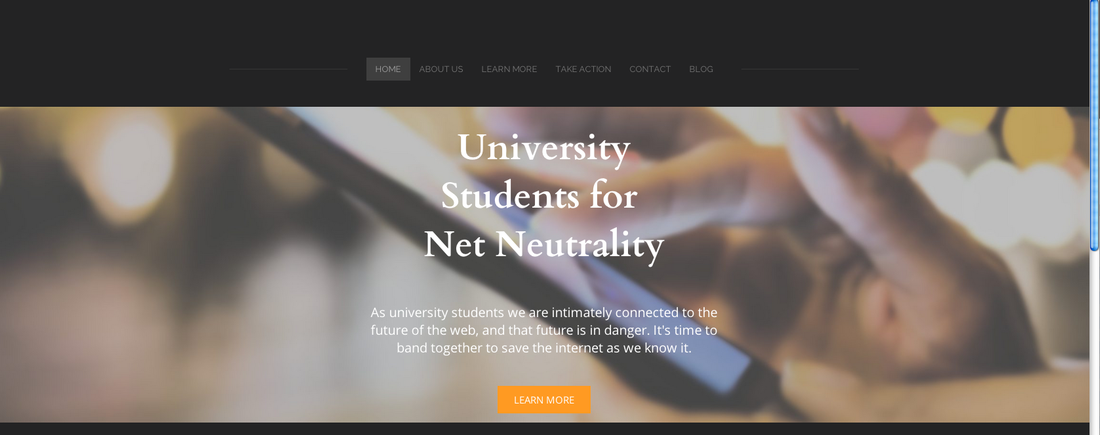
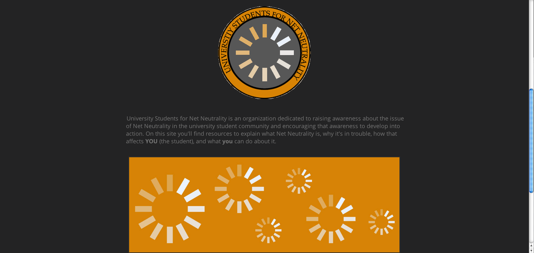
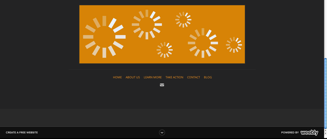
Content: I have chosen to make this page a landing page. I am keeping it simple and digestible with easy to understand navigation at both the top and bottom of the page. The page includes a main banner with the the name of the organization and a short tagline intended to draw the reader in. There is also a button that leads right to the "Learn More page". Underneath this is the current revised logo (which might change again) and the mission statement for the organization. Beneath this is a bottom banner featuring loading symbols on an orange background. At the bottom is a footer featuring links to all pages featured at the top and a social media bar. Right now only the email icon shows up because that is all I have linked in, but soon it will include links to different social media profiles such as twitter, facebook, and youtube.
Organization: I have organization this page as a place to get introduced to organization in very basic terms with ample links to the pages with more info. The goal is for the navigation to be clear on the homepage and make the site very easy to navigate in the hopes that this will encourage visitors to explore more of the site. I have kept the home page brief for this reason. The homepage should introduce the movement and them guide visitors to the rest of the site.
Images: I have chosen an overall "loading symbol" motif. This is because the loading symbol is the most recognizable existing symbol of this movement. I have included this symbol in the logo and the banner at the bottom of the page, but done so in the colors of the site/organization. For the main image I chose a close up of someone using a mobile phone to call to attention the everyday nature of how Net Neutrality can affect all of us.
Color: I have decided to go with a black and grey color scheme with orange as my accent color. I chose black and grey to emphasize sleekness and style while still looking professional. Grey in particular is also associated with neutrality so it was a clear choice for that reason as well. I have chosen to use orange as my accent color because orange is associated with excitement and boldness. I want to keep in mind that even though this is a serious topic there is room for excitement and boldness, because that is exactly what this movement needs - energy!
Font: I went with the default sans-serif for most of the text on the site because it is clean and easy to to read. It also fits nicely with the rest of the site design (which is why it was packaged with it). That said, I wasn't a fan of the default serif font for Headlines and Paragraph headings. I changed this to another serif font "Cardo". I decided to keep the serif aspect because headlines and paragraph headings are large enough for a serif font to be readable and because visually they are more interesting and add a touch of flair to the text on the site. I chose Cardo because it is aesthetically pleasing, yet professional.
 RSS Feed