Website: The Franklin Institute
What is it/Where was it?
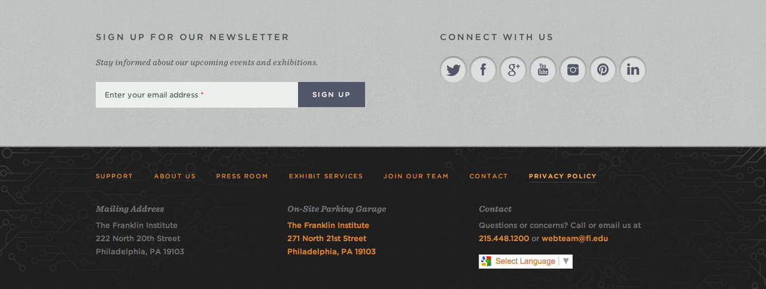
On the bottom of each page of the site.
What didn't work:
From what I could see all of the links worked. The only issue I noticed is that when the translation option is used it messes up some of the text knocking "Privacy Policy" down onto the next line with almost no spacing which looks awkward.
What did work:
It is a really effective way of allowing visitors to go back to the home page or directly access other pages once they have finished reading the page they are on without scrolling all the way back up to the top. It is also a clever place to put all of their social media and contact information as it is at the bottom of every page. This way when a visitor reads to the bottom of any page they are reminded of the Franklin Institute's social media accounts and encouraged to sign up for their newsletter. This could be a really good choice for the newsletter as many visitors may not have gone looking for it, but may be inclined to sign up since it is conveniently presented to them.
Translation to my site:
I really like the color choices used for this bottom navigation. I like the choice of grey and charcoal. I feel they look both stylish and professional which would be appropriate for a serious topic such as Net Neutrality. I also really like the orange used as an accent color to give the color scheme some boldness and personality without looking too playful. I think these could be good inspirations for my color scheme. I want to hit upon a look that is aesthetically pleasing and stylish without being playful or childish.
I also think that bottom navigation itself could be a useful element to incorporate into my site and one that I had previously overlooked. I also think this could be a good place to link my social media accounts. While visitors may not be inclined to go looking for them, perhaps by placing them at the bottom of every page they will be inclined to check them out.
What is it/Where was it?
On the bottom of each page of the site.
What didn't work:
From what I could see all of the links worked. The only issue I noticed is that when the translation option is used it messes up some of the text knocking "Privacy Policy" down onto the next line with almost no spacing which looks awkward.
What did work:
It is a really effective way of allowing visitors to go back to the home page or directly access other pages once they have finished reading the page they are on without scrolling all the way back up to the top. It is also a clever place to put all of their social media and contact information as it is at the bottom of every page. This way when a visitor reads to the bottom of any page they are reminded of the Franklin Institute's social media accounts and encouraged to sign up for their newsletter. This could be a really good choice for the newsletter as many visitors may not have gone looking for it, but may be inclined to sign up since it is conveniently presented to them.
Translation to my site:
I really like the color choices used for this bottom navigation. I like the choice of grey and charcoal. I feel they look both stylish and professional which would be appropriate for a serious topic such as Net Neutrality. I also really like the orange used as an accent color to give the color scheme some boldness and personality without looking too playful. I think these could be good inspirations for my color scheme. I want to hit upon a look that is aesthetically pleasing and stylish without being playful or childish.
I also think that bottom navigation itself could be a useful element to incorporate into my site and one that I had previously overlooked. I also think this could be a good place to link my social media accounts. While visitors may not be inclined to go looking for them, perhaps by placing them at the bottom of every page they will be inclined to check them out.
 RSS Feed