What is Net Neutrality?
Why Should I Care?
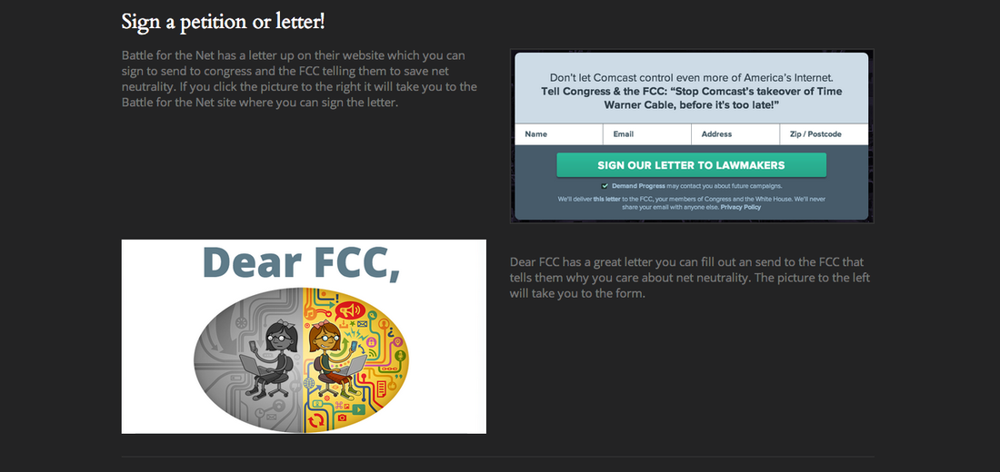
Take Action
What is Net Neutrality? Why Should I Care? Take Action
0 Comments
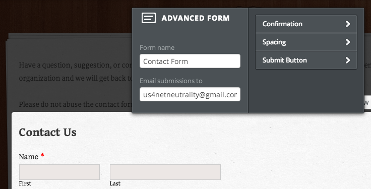
I have chosen to use a footer my site map. The footer contains the same links (to all main pages) as the top navigation bar and will be present on each page to help make navigating the site as easy as possible.
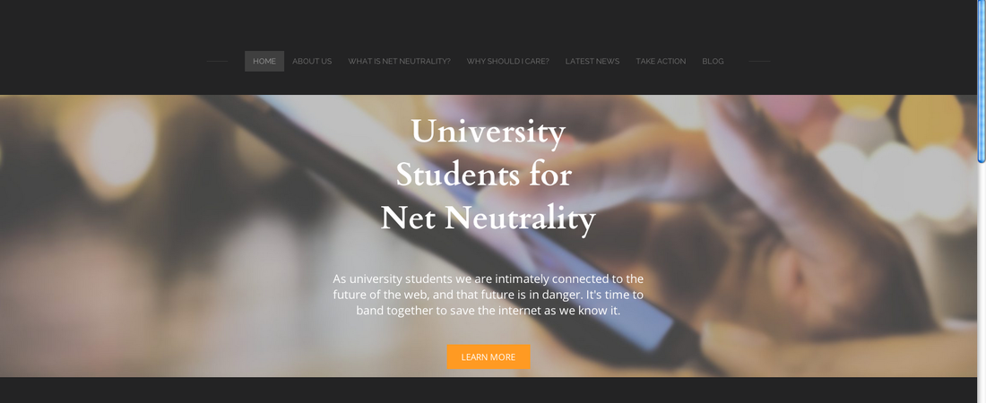
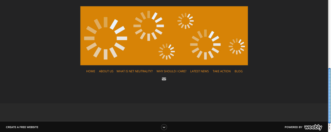
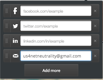
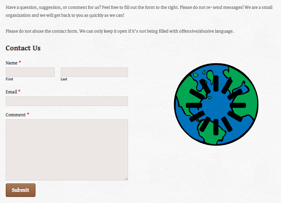
The main navigation consists of a link to the home page, about US page (about the organization), "What is Net Neutrality?", "Why should I care?", "Latest News", and "Take Action" pages. There is also a link to the class blog. I have renamed the "Learn More page" to be "What is Net Neutrality" and this will function as the main resource for informing visitors about the basics of net neutrality. The "Why should I care?" page is going to focus on how net neutrality specifically affects university students. The "Latest News" page will be a place to get the latest updates on the fight for net neutrality. Finally the "Take Action" page will have resources for getting involved in the fight (including but limited to sample letters to representatives). In order to keep my menu items to a maximum of seven and keep the navigation from getting congested, I have deleted the contact page and instead placed the contact form on the home page. I still intend for the home page to be a landing space designed to direct the visitor to the rest of the site, but I felt this was an appropriate compromise. I want my navigation to be as simple and natural as possible. I don't want it's complexity to distract from the content. I want it to be effective, but in the background. Ideally it should be an afterthought to the visitor. I have chosen to include a footer for this reason. The visitor does not have to scroll back to the top to get to the next page they want to read. I am also placing social media and email links at the bottom of every page in order to encourage the visitor to check them out without making the visitor do any extra work to find them. I have also chosen simple but thought provoking names for the pages ("Why should I care?") that get the visitors attention and create interest. 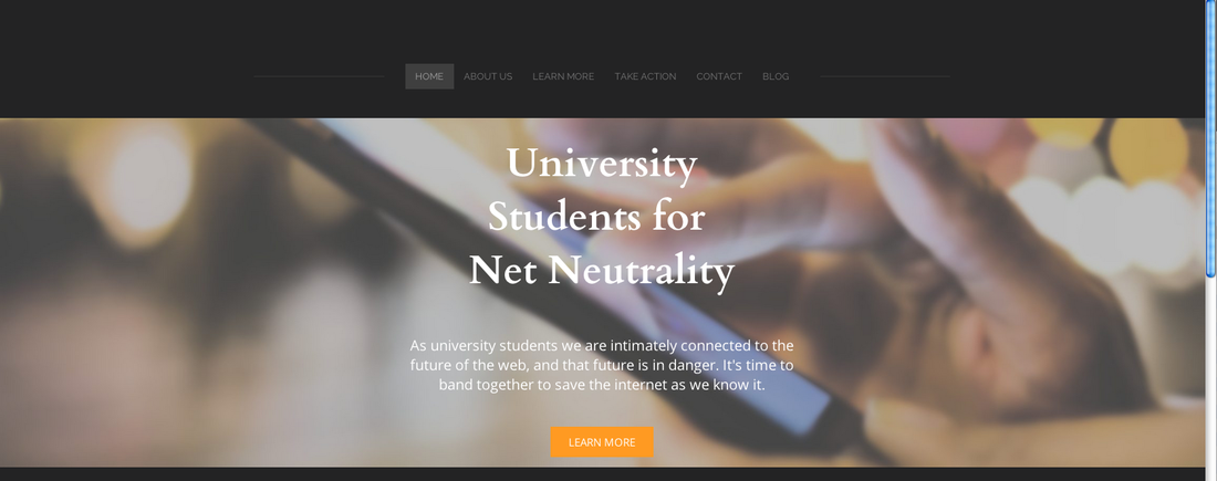 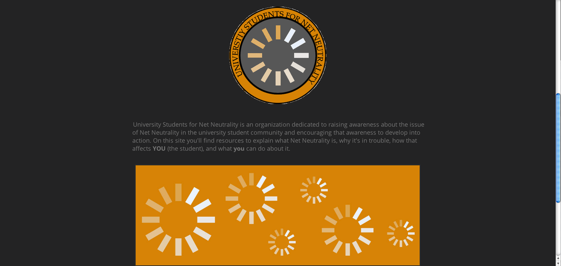 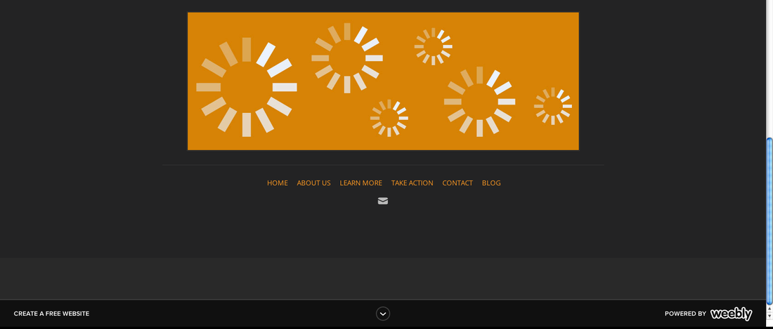 Content: I have chosen to make this page a landing page. I am keeping it simple and digestible with easy to understand navigation at both the top and bottom of the page. The page includes a main banner with the the name of the organization and a short tagline intended to draw the reader in. There is also a button that leads right to the "Learn More page". Underneath this is the current revised logo (which might change again) and the mission statement for the organization. Beneath this is a bottom banner featuring loading symbols on an orange background. At the bottom is a footer featuring links to all pages featured at the top and a social media bar. Right now only the email icon shows up because that is all I have linked in, but soon it will include links to different social media profiles such as twitter, facebook, and youtube.
Organization: I have organization this page as a place to get introduced to organization in very basic terms with ample links to the pages with more info. The goal is for the navigation to be clear on the homepage and make the site very easy to navigate in the hopes that this will encourage visitors to explore more of the site. I have kept the home page brief for this reason. The homepage should introduce the movement and them guide visitors to the rest of the site. Images: I have chosen an overall "loading symbol" motif. This is because the loading symbol is the most recognizable existing symbol of this movement. I have included this symbol in the logo and the banner at the bottom of the page, but done so in the colors of the site/organization. For the main image I chose a close up of someone using a mobile phone to call to attention the everyday nature of how Net Neutrality can affect all of us. Color: I have decided to go with a black and grey color scheme with orange as my accent color. I chose black and grey to emphasize sleekness and style while still looking professional. Grey in particular is also associated with neutrality so it was a clear choice for that reason as well. I have chosen to use orange as my accent color because orange is associated with excitement and boldness. I want to keep in mind that even though this is a serious topic there is room for excitement and boldness, because that is exactly what this movement needs - energy! Font: I went with the default sans-serif for most of the text on the site because it is clean and easy to to read. It also fits nicely with the rest of the site design (which is why it was packaged with it). That said, I wasn't a fan of the default serif font for Headlines and Paragraph headings. I changed this to another serif font "Cardo". I decided to keep the serif aspect because headlines and paragraph headings are large enough for a serif font to be readable and because visually they are more interesting and add a touch of flair to the text on the site. I chose Cardo because it is aesthetically pleasing, yet professional.
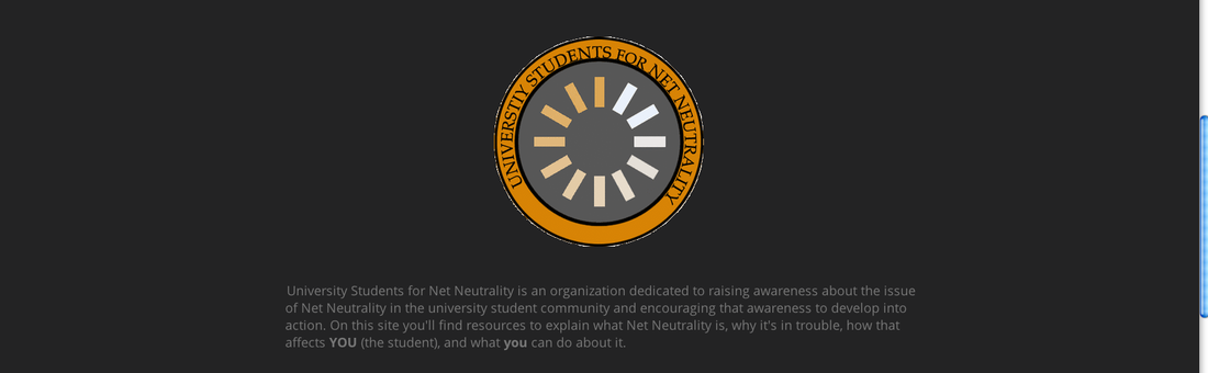
The mission of University Students for Net Neutrality is to raise awareness of Net Neutrality as an issue which affects university students and give those students the resources to learn more about the issue and to take action.
I chose to do this logo in the shape of a college crest with globe in the center and a loading symbol over the globe. The shape is intended to be representative of the target demographic for the organization: university students. The globe is representative of the internet and the loading symbol is representative of the danger the internet is in. The loading symbol is also already associated with the fight for Net Neutrality. I chose blue and green not just because those are the colors for a globe, but because blue is associated with progress and freedom and green is associated with security and trust. Grey is associated with balance and also neutrality. I am going back and forth on the orange. On one hand I like the orange, because it livens up the logo. Orange is also associated with success, enthusiasm, and creativity. On the other hand the grey seems like it could be more professional. Not to mention that grey is associated with neutrality (a clear choice!?). 
The font I chose is Perpetua Tilting MT. I chose this font because I felt that it was both classic and stylish. It has flair and is fun while still looking professional. I feel this reflects my personality as I pride myself on qualities such as dependability and communicating with others. I think at first glance this could seem like a boring choice, but I feel that this font is balanced and aesthetically pleasing. It is also easy to read. One of the things that I strive for in both my personal and professional life is to be a good communicator.
I chose grey because grey is one of my favorite colors. It represents balance and calm which are things that I strive for. It also represents practicality which is something that I feel is a big part of how I try to approach life. I try to balance practicality and my ideals (not that they are always mutually exclusive). I chose a black font because it's classic and attractive. It is easy to read and works well with grey. Black is also the color of boldness. Despite all of my emphasis on practicality I do like to have fun and I like to try to be brave in the work that I make. Especially as a screenwriter where I often feel like there is a fine line to walk in how much one reveals about themselves through their work. 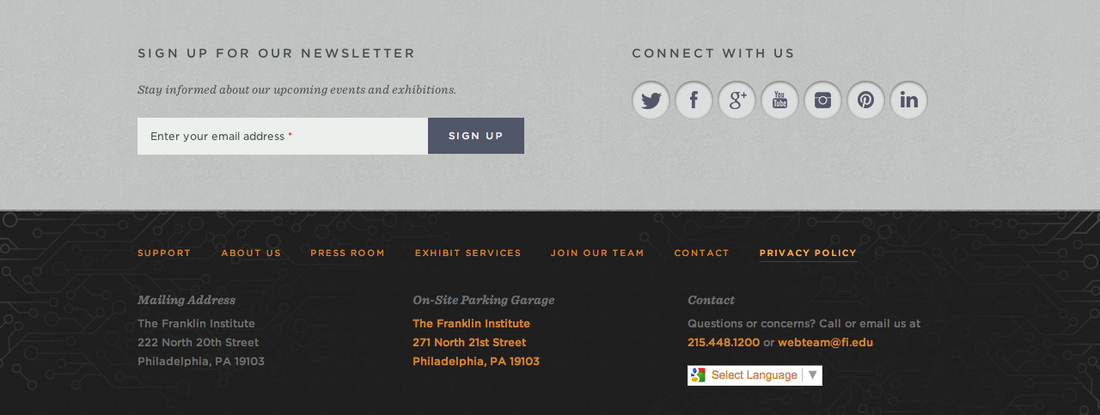
Website: The Franklin Institute
What is it/Where was it? On the bottom of each page of the site. What didn't work: From what I could see all of the links worked. The only issue I noticed is that when the translation option is used it messes up some of the text knocking "Privacy Policy" down onto the next line with almost no spacing which looks awkward. What did work: It is a really effective way of allowing visitors to go back to the home page or directly access other pages once they have finished reading the page they are on without scrolling all the way back up to the top. It is also a clever place to put all of their social media and contact information as it is at the bottom of every page. This way when a visitor reads to the bottom of any page they are reminded of the Franklin Institute's social media accounts and encouraged to sign up for their newsletter. This could be a really good choice for the newsletter as many visitors may not have gone looking for it, but may be inclined to sign up since it is conveniently presented to them. Translation to my site: I really like the color choices used for this bottom navigation. I like the choice of grey and charcoal. I feel they look both stylish and professional which would be appropriate for a serious topic such as Net Neutrality. I also really like the orange used as an accent color to give the color scheme some boldness and personality without looking too playful. I think these could be good inspirations for my color scheme. I want to hit upon a look that is aesthetically pleasing and stylish without being playful or childish. I also think that bottom navigation itself could be a useful element to incorporate into my site and one that I had previously overlooked. I also think this could be a good place to link my social media accounts. While visitors may not be inclined to go looking for them, perhaps by placing them at the bottom of every page they will be inclined to check them out. 1. Create a website that will provide resources geared toward teaching college students about Net Neutrality and encouraging them to get involved. 
2. Promote awareness about Net Neutrality among college students. 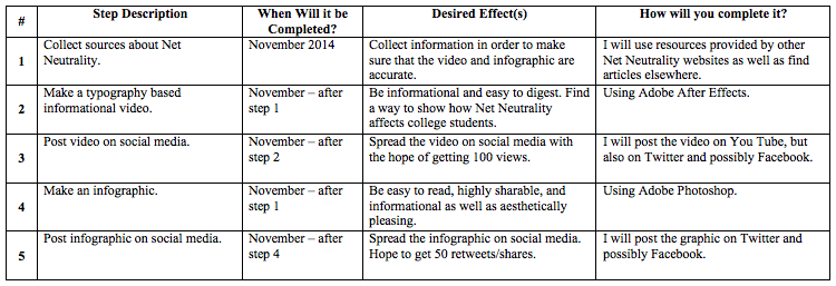
3. Provide resources to help students take action to protect Net Neutrality. 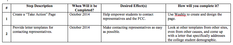
| ArchivesDecember 2014 CategoriesAll |


 RSS Feed